Why Do I Need It?
With Fenorri, you can instantly create data forms. That means for any requirement to collect, store, process and display data, you can create a form. Everything is done via drag-and-drop with minimum field configuration. That saves a lot of time. For example, to create a form with 10 entries you need 2 minutes. The system then automatically generates the user data input form screen, a view where you can browse, sort and search the data for that form, and the ability to edit and delete data entries. You can then use your data forms inside reports and business processes, as well as you can use them inside other forms. The idea is to allow you to manage your data by having the ability to do everything on the spot, without having to spend any additional money, time or resources.Create Forms Instantly
Yes, now you can create and instantly deploy forms! Then you can add/edit/delete data records, plus view or search all records
Data Or Master Data
You can create your usual data forms, as well as form with master data (which can be then used by other forms, reports, and business apps).
What's the difference between data forms and master data forms?
Fenorri allows creating input forms and master data forms. Both type of forms are created in the same way, with the only difference that master data forms should be used for storing look-up data. For instance, you can have a master data form that is storing a list of currencies. Then you can use this list in other forms (e.g. for a checkbox, radio, or select type of form controls). That way your data will be consistent across different forms, making it easier to create reports and business apps.
When should I use master data forms?
You should always try using master data forms for storing data that is not likely to change. For instance, a list of countries or currencies is not likely to change. Even if you have to add new entries or modify the existing ones, this will not be happening constantly. Yet, this list of currencies or countries is likely to be used by other forms. For example, a client registration form will use the list. Your invoice form will also need to specify both the country and the currency. In this case you need to create your currencies/countries form as a master data form. It will be used as a look-up reference by all other forms that need to store country/currency information. Having this approach will also allow creating reports, as you'll be able to link various forms via the country field for instance. This not only saves you from ending up having a mess in your data forms, but saves your time when dealing with your data forms, reports, and business apps.
Open
Open your top menu and click on the 'Data Forms' item: 
To open Master Data, click the next menu item:
You will see a board, and if you have any forms, the board will contain them that contains your forms (if you have any).
Create New Boards
You can create a new board to place your resources by pressing the following button:
You can then create your new board by using the following form:
Editing Boards
You can edit your board by pressing the following button: 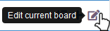
You will get a dialogue where you can specify your board's name and description:
View Not Published
By clicking the following option, you'll be able to view forms which are currently not published. 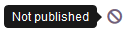
Your cards on this board will have a different drop-down menu:
If you wish to publish a form, select the 'Publish' option. If you need to archive or edit it, select the 'Edit' or the 'Archive' options respectively.
View Archived
To view your archived forms, press the following button: 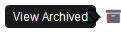
Your form cards will have a drop-down menu. If you wish to change your form from being archived, select 'Publish'. If you wish to delete your form forever, select the 'Delete forever' option.
Form Cards
Your boards will contain forms, represented as cards:
You can click the 'Open' button to simply open your form. You can also click the edit button to edit it: 
By clicking the following button, you'll be able to add your form to a board: 
Each form card has a drop-down menu. It contains the edit button and two more buttons to 'unpublish' or 'archive' a form. By unpublishing, you'll simply disable your form and it will not be available for business apps and reports. The same applies if you archive your form, with the only difference that after archiving a form you can delete it forever.
Create a New Form
To create a new form select the following menu option:
You will see the form editor which you can use now to create your form.
Fenorri Form Editor
Inside the editor you can drag-and-drop your input form components:
Each component can be configured. You can always delete a component or move it to a different position.
Form Configuration
Your form contains form title and description, where you can briefly describe what your form should be used for. By enabling the 'Published' option you make the form published. In case you disable this option, the form will not be published and other resources (such as other forms, reports and business apps) will not be able to use it. In case you would like to archive your form, simply tick the 'Archived' option.
In case you need your form to be a master data form, tick the following option:
View What's Using This Form
You can instantly see what is using your form by clicking the following button. For instance, it might show that a report or a business app is using your form. You need this option to ensure that whenever you change something in your form, you will need to address your changes in all other things which are dependent on the form.
You can enable the following option in case you want users with access to this form to receive an automated notification whenever a file gets uploaded via this form. This is an optional parameter. An example of when this is useful would be the following. Consider that you have a form where end-users need to attach a sales contract. You want everyone with access to this form to automatically be notified 'New Sales Contract Uploaded', and everyone will be constantly informed.
Table View Configuration
By default, the system is recording record's creating and modification dates, as well as who has created and modified the record. This information is hidden by default, but you can use the following options to display this information in your form's table view.
Each form will automatically get a page where you can browse through the records, view, edit or delete them. If you enable all of the above options, each row in your table will contain additional information:
Please note, this data and the ability to display it in your table view is only for maintenance purposes and is not impacting on your forms functionality.
Create Master Data Forms
Any form can become a master data form. In the form configuration, select the following option:
Saving or Creating New Forms
You can save your form, create a new form, or save your form as new, by selecting the buttons located at the bottom of your form editor.
You can instantly see what is using your form by clicking the following button.
For instance, it might show the business apps that are using this form:
If your form is being used by other resources, you will see the following message:
The buttons give you 3 options:
- It will deactivate everything that uses your form, cancel all instances of running business apps and delete all inserted data through those apps.
- It will deactivate everything that uses your form, cancel all running instances of business apps, but will NOT delete the data that was inserted via those apps.
- It will not save the form
As you can see, the only difference between the first and the second option is that in the first case it will delete the inserted data, while in the second case it will not delete any data.
Form Fields
Your form can contain one or more fields. There are two settings that all fields share. The first one is the field label, used to name your field and normally allows to display that title at the form (for data input fields especially):
The following option allows to hide or display your field inside the table view:
If this checkbox is ticked, that particular field will not be shown inside the table view of your form, which normally looks similar to the following:
Some fields also have the following option. If enabled, it makes the field mandatory (i.e. end-users will not be able to submit the form unless they fill in the field with data). You can also enter a custom error message that will be shown if the field is left blank.
Sometimes you can also set your field's icon:
For instance, if we set the field to have an icon:
Then our field will look like the following inside the form:
Text Box
This field is used for text input and can contain any text-related data.
The placeholder setting allows entering some text, e.g.:
This will set the input's placeholder:
If you make the field hidden, it will not appear inside the form but will be there as a hidden field. Hidden fields can be used for data storage.
If you want the system to insert a random value into your text field (e.g. this can be useful for generating a unique ID number), then you can enable the following option:
The next option will generate a custom structured value:
It can be used, for instance, to generate the receipt ID. Use the following guideline for creating your auto-generated value:
- {C} will insert the auto-incremented number (that will start from 1)
- {Y} will insert current year (e.g. 17)
- {YYYY} will insert current year (e.g. 2021)
- {M} will insert current month (e.g. 01)
- {D} will insert current date (e.g. 30)
Do not put spacing inside your curly brackets {}
Text Area
This field is useful if your data input will contain larger text.
You can use the following option for setting the maximum field size (i.e. what is the maximum allowed number of characters?):
This field should be used for inserting and storing email addresses.
You can use the following option for setting the maximum field size (i.e. what is the maximum allowed number of characters?):
CheckBox
This will allow providing multiple-choice input.
Your checkbox can contain either hardcoded data values, or they can come from a master data form. If you would like to hard code your data, select the following option:
Then click the 'add new' button:
Add your data values:
Your data values can be removed by clicking the X button:
You can instantly see the result inside the form editor:
In case you would like the data to come from a master data form, select the following option:
Please note, you can only use this option if you have at least one master data form. Create one before you use this option. Please also ensure that your master data form contains data. Otherwise, it will not be possible to populate your checkbox with data. Then click the 'plus' button. You will see a dialogue screen that contains your master data forms. Select your master data form by pressing 'Select':
Now you need to select a data field which will provide the data for your checkbox:
After you click on 'Done', you'll see something similar to the following:
Your checkbox will be automatically filled with data coming from the master data form:
How can we display only specific values from the master data?
If you only want certain values from the master data to appear, follow these steps: Click on the configuration button.
Choose the values you wish to include, and save your settings.
From now on, your control will display only the selected values.
Radio
This element allows providing a single choice input.
Your radio can contain either hardcoded data values, or they can come from a master data form. If you would like to hard code your data, select the following option:
Then click the 'add new' button:
Add your data values:
Your data values can be removed by clicking the X button:
You can instantly see the result inside the form editor:
In case you would like the data to come from a master data form, select the following option:
Please note, you can only use this option if you have at least one master data form. Create one before you use this option. Please also ensure that your master data form contains data. Otherwise, it will not be possible to populate your checkbox with data. Then click the 'plus' button. You will see a dialogue screen that contains your master data forms. Select your master data form by pressing 'Select':
Now you need to select a data field which will provide the data for your radio:
After you click on 'Done', you'll see something similar to the following:
Your radio will be automatically filled with data coming from the master data form:
How can we display only specific values from the master data?
If you only want certain values from the master data to appear, follow these steps: Click on the configuration button.
Choose the values you wish to include, and save your settings.
From now on, your control will display only the selected values.
Select
This field can be filled with data entries, each providing one single selecting choice.
Your select can contain either hardcoded data values, or they can come from a master data form. If you would like to hard code your data, select the following option:
Then click the 'add new' button:
Add your data values:
Your data values can be removed by clicking the X button:
You can instantly see the result inside the form editor:
In case you would like the data to come from a master data form, select the following option:
Please note, you can only use this option if you have at least one master data form. Create one before you use this option. Please also ensure that your master data form contains data. Otherwise, it will not be possible to populate your checkbox with data. Then click the 'plus' button. You will see a dialogue screen that contains your master data forms. Select your master data form by pressing 'Select':
Now you need to select a data field which will provide the data for your radio:
After you click on 'Done', you'll see something similar to the following:
Your element will be automatically filled with data coming from the master data form:
How can we display only specific values from the master data?
If you only want certain values from the master data to appear, follow these steps: Click on the configuration button.
Choose the values you wish to include, and save your settings.
From now on, your control will display only the selected values.
File
This can be used for uploading and storing files.
You can specify how many files can the end-user attach:
Calendar
This field allows selecting the date/time type of input.
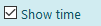
This field can show date, time, or date with time, and you can achieve this by enabling the following options: 
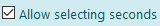
If you are showing time, then you can enable minutes and/or seconds: 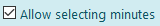
Calculate
Whenever you need to perform a calculation with the other form fields, you can rely on this field. It can take one or more form fields and execute a mathematical expression in real-time.
You can create a formula for calculating a customer discount for instance, and it will perform the calculation directly inside the form, while the end-user inserts their data. The result, calculated by this field, will either be hidden or visible. You can manage this by enabling or disabling the field visibility inside the following controls:
To create your formula, click the following button:
You will see a dialogue containing your form editor screen and a bunch of text fields that your form has (i.e. you need to add some text fields, for instance, 'Price' and 'Quantity'). You can drag-and-drop your text fields inside the text editor:
Your formula can contain a mathematical expression using any of the following:
- + (to add)
- - (to subtract)
- * (to multiply)
- / (to divide)
- You can use brackets to separate your calculations ()
You can use data from previous steps and numbers only!
For example, it could be something like this:
Display Data
If you need to display data from other forms, you can use this field.
When you drop it into your form, you will see a dialogue with a bunch of data input forms to chose from:
Select your form as shown above. You will see the input fields from that data source on the right side. Select your fields, for example:
Which will result in having the form field containing read-only data:
WYSIWYG
In case you need to put a fancy paragraph with text, you can use this field. It's not going to accept user input, but can be helpful for end-users. For instance, it can contain some instructions, pictures, etc.
Click the edit button:
You will see the following editor:
To enter an element, click the following button: 
You will see the following options to choose from: 
Select your text to change the formatting:
Once you're done, click the following button: 
Users
This input field can be used for selecting your colleagues. For instance, you want to have a form that records who was absent from a team meeting, and this field will allow to search and select one or more users.
When this field is visible, it will be possible to enter up to 50 users:
If you decide to make this field hidden, then you will need to choose one of the following:
For instance, you might want to have a hidden field that automatically records the last user that is filling in this form.
Change Access Permission
To allow other users to view or manage your form, you can click the 'lock' button:
You will see a dialogue where you'll be able to add or remove users, groups, departments, projects, and events. Start typing a person's name (or department/group/event/project name) and select your user.
Once you're finished, click the following button: 
You can constantly change access permission settings for your resources. Try to always keep the right level of authorization and ensure that your resources are shared with the right people within your organization. In general, you need to give 'Administrator' permission only to those users who need to manage your resources. You can share your resources with groups, add them to events or projects, or simply grant an access right to people from a specific department. In case you want everyone in your organization to have access to your resource, simply enable the following option:
This will ensure that absolutely everyone can view the resource. However, if you need your resource to appear on a group/department/event/project resource page, you need to add this group/department/event/project separately.
Form Comments
By clicking the 'comments' button of your form, you can open the form comments:
You can add text comments, mention people, insert hyperlinks and emoji, as well as insert other resources by clicking the 'attach' button. You can attach files, reports, business apps, and emails.
Add New Record
You can add a new entry by opening your form board, and at the bottom of each form card you have a button: 
Alternatively, if you are viewing all records, at the top of the screen you will have the following button that will also allow adding a record:
The form will look like whatever you have designed it to be. You can add records by filling in your data and pressing the 'OK' button at the bottom of the screen:
View, Edit & Delete
You can view your form records by opening your form board, and at the bottom of each form card you have a button: 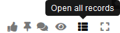
You will see a table that should contain your records:
Each record can be edited or deleted by pressing one of the following buttons: 
To sort your records by a certain column, click the column. You can sort in ascending or descending order. 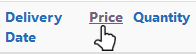
Search
You can search text data inside your form by clicking the following button and typing in your query: 
Integrating with External Databases
You can connect to other databases. This is done at the table level, requiring each external database table to be imported individually.
After importing an external database table, it will function like a standard form, enabling you to use it within no-code applications and business intelligence tools.
To import an external database table, go to the Forms or Master Data menu at the top.
Select the menu option below to begin importing an external table:
A dialog box will appear where you can enter all the details for your external database table.
An imported external database table will be displayed as a standard form in the system:
If you have write permissions for the external database table, you'll be able to edit data; otherwise, you'll only have access to view it.
Please note that all data will be stored in the external database, not locally. You will access all the data from the external database, which means any network latency could affect performance, depending on the system you’re connecting to.
If the structure of your external database table changes, you can open the imported form and select the menu option below:
A dialog box will appear where you’ll need to enter your password and submit the form.
Please note, some data formats are not supported, and this limitation is imposed by the database technologies, not us.
The system will automatically skip fields which have the following format: BIT, BINARY, TINYBLOB, BLOB, MEDIUMBLOB, LONGBLOB, TINYTEXT, MEDIUMTEXT, LONGTEXT, ENUM, SET, Geometry
Inside Business Apps
You can add your form to a business app It can be added as a data input form or a data source for reading or writing data. There are three ways of how a data input form can be used inside the business app:
- Input Form
- Data Access
- Data Select
Input Form
Your forms can be used inside a business app. You can easily add an input form block inside your business app by dragging and dropping the following:
You will see the following inside your diagram:
You can set your block's name and its icon by configuring the following:
You need to select your form by using one of the following options:
You will be prompted with a dialogue where you can choose your form, e.g.:
Once you select your form, you can continue with the configuration. Your data input form can perform one of the following:
- Allow adding new data
- Allow editing existing data
- Display read-only data for a single existing record
Add New Data
If you want to use your input form to add new data (e.g. the end-user needs to enter a new customer order while executing your business app), select the following option:
For this option, you can pre-set your data. That means if you have any previous steps in your business app which contain data, and you would like to take this data and insert it inside the form, you can click the following option and configure that:
You can select any field inside your form and set the data by clicking on the 'configure' button next to the field, e.g.:
You will see an editor where you can either hard code your value, or set it from a previous step. You can only set it from a step that contains suitable data. Your editor will contain such steps, e.g.:
Just drag-and-drop a previous step into the editor, e.g.:
You'll be asked to select the data field that you wish to get the data from, e.g.:
Once you've selected your data source, it will appear in the editor:
If you tick the 'Disable this field' option, this field will be disabled during the business app execution and the end-user will not be able to fill it in. Once you're done with editing, click the 'Apply & Close' option.
Edit Existing Data
If you would like the end-user to edit existing form data while executing a business app, select the following option:
This option can be used in case your end-user needs to modify a customer order, for instance, while executing a business app. You need to specify which record would you like to edit, which is configured in the following section:
You can set your record manually by clicking that option:
You'll be asked to select your record, e.g.:
You can also select the record from a previous step. Your previous step needs to contain the same data source as this step, and if so, it will appear in the configuration section and you'll be able to select it:
Once you have selected your record manually or from a previous step, you can set the record values. For this option, you can pre-set your data. That means if you have any previous steps in your business app which contain data, and you would like to take this data and insert it inside the form, you can click the following option and configure that:
You can select any field inside your form and set the data by clicking on the 'configure' button next to the field, e.g.:
You will see an editor where you can either hard code your value, or set it from a previous step. You can only set it from a step that contains suitable data. Your editor will contain such steps, e.g.:
Just drag-and-drop a previous step into the editor, e.g.:
You'll be asked to select the data field that you wish to get the data from, e.g.:
Once you've selected your data source, it will appear in the editor:
If you tick the 'Disable this field' option, this field will be disabled during the business app execution and the end-user will not be able to fill it in. Once you're done with editing, click the 'Apply & Close' option.
Display Read-Only Data
If you simply need to display some data during the execution of a business app, select the following option:
This option is useful in case you need to present your end-user with some data that helps them to review something before making a decision. For instance, a business app that allows offering a discount to an existing customer, where the end-user needs to verify that the customer that was selected for a discount is correct, before sending it via the email. You need to specify which record would you like to display, which is configured in the following section:
You can set your record manually by clicking that option:
You'll be asked to select your record, e.g.:
You can also select the record from a previous step. Your previous step needs to contain the same data source as this step, and if so, it will appear in the configuration section and you'll be able to select it:
Data Access
Your input forms can also be used as data sources for reading or writing data. You can easily add a data access block inside your business app by dragging and dropping the following:
You will see the following inside your diagram:
You can set your block's name and its icon by configuring the following:
You can either read or write data inside this block.
Read Data
To enable data reading features, select the following option:
If you also check the 'Exit app if no data found', the business app will exit at this point every time it does not find any data while reading it. Use this option only when reading data is critical and your business process cannot function unless it has data inside this block.
You can specify 2 types of data location:
- Form
- Previous Step
Form
Select the following option:
You need to select your form by using one of the following options:
You will be prompted with a dialogue where you can choose your form, e.g.:
Once you select your form, you can continue with the configuration. Now you need to tell the block how to find the data you wish to read. You will see that your configuration area now contains some additional features:
You can either set filters or select manually your records. You will only need to manually select your data in case you know what the data is before even anyone executes your business app. For instance, it's a record that the business app needs to read, and it will always remind that way. It could be some constant data, such as supplier address, and every order needs to include it, and you know it will not be changed during the execution of the business app. In that case, you need to click the following option:
Then you can select your record manually:
In case you need to set filters, you can do so by applying your filters to the fields of your form. For instance, we want to only select records where the first name is 'John'. We will have to click on the field:
We'll see a dialogue where we need to click the '+' button to add a new filter:
We will see the filter configuration, e.g.:
We can change the filter condition. In the example above we have a choice between 11 filter conditions. We will leave it as '=', and we'll click the 'Set Value' button to configure what to compare it with:
We will see an editor where we can either hard code our value, or select it from a previous step that contains suitable data, e.g.:
We can drag-and-drop a previous step if we want to, and then it will be running the filter and checking it against the data that contains inside the previous step. In our case we will just simply type 'John' into the editor:
We'll click on 'Apply & Close' to close the filter editor, and then again we'll click 'Apply & Close' to close all filters for this field. We will see that the field has now changed the color and it has a 'filter' icon on it:
We can continue setting filters for other fields if we need to. We can always check what kind of results will we get by clicking the following button: 
If we have more than one file, we can set the block to check if all filters match or any inside the following option:
If we set it to 'Any', then if the block finds at least one filter match, it will treat it as a successful operation and use that data. If we set it to 'All', then the block will only use the data when it finds matches to all your filters. If you only have one filter, this setting is not going to have any effect.
Previous Step
You can also select the record from a previous step. Your previous step needs to contain the same data source as this step, and if so, it will appear in the configuration section and you'll be able to select it:
Data Select
Your input forms can also be used inside the data select block. The purpose of this block is to allow you the opportunity to ask your end-user, for instance, 'Here are the data records. Which ones should we use for further processing?'. For example, you want the end-user to select a particular record from one of the following:
The end-user can click the 'select' button: 
Their choice will be recorded by this block, and you can access the data the end-user has selected in further steps of your business app. For instance, in the example above, the end-user selects Maria Johns, and in the following step you might be generating an email so that based on the data the end-user has selected, it would be 'Dear Maria, etc.'. This allows you to let the end-user decide which data needs to be processed, all they have to do is select the one they need. You can easily add a data access block inside your business app by dragging and dropping the following:
You will see the following inside your diagram:
You can set your block's name and its icon by configuring the following:
You need to set your screen's message by entering it into the following text area:
Data Location
Your data can come from either a form or the previous step.
Form
In case you would like the end-user to select their data choice from a form, select the following option:
You need to select your form by using one of the following options:
You will be prompted with a dialogue where you can choose your form.
Previous Step
You can also select the record from a previous step. Your previous step needs to contain the same data source as this step, and if so, it will appear in the configuration section and you'll be able to select it:
Which fields to display?
You can decide which fields would you like the end-user to see, which is why you have the following section:
Your selected fields will change their color:
Was this article helpful?